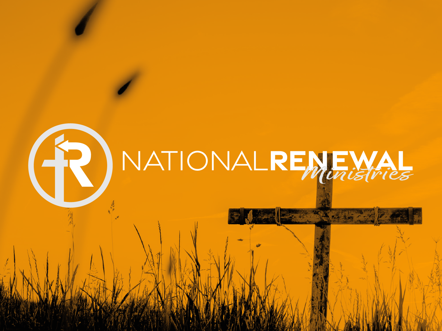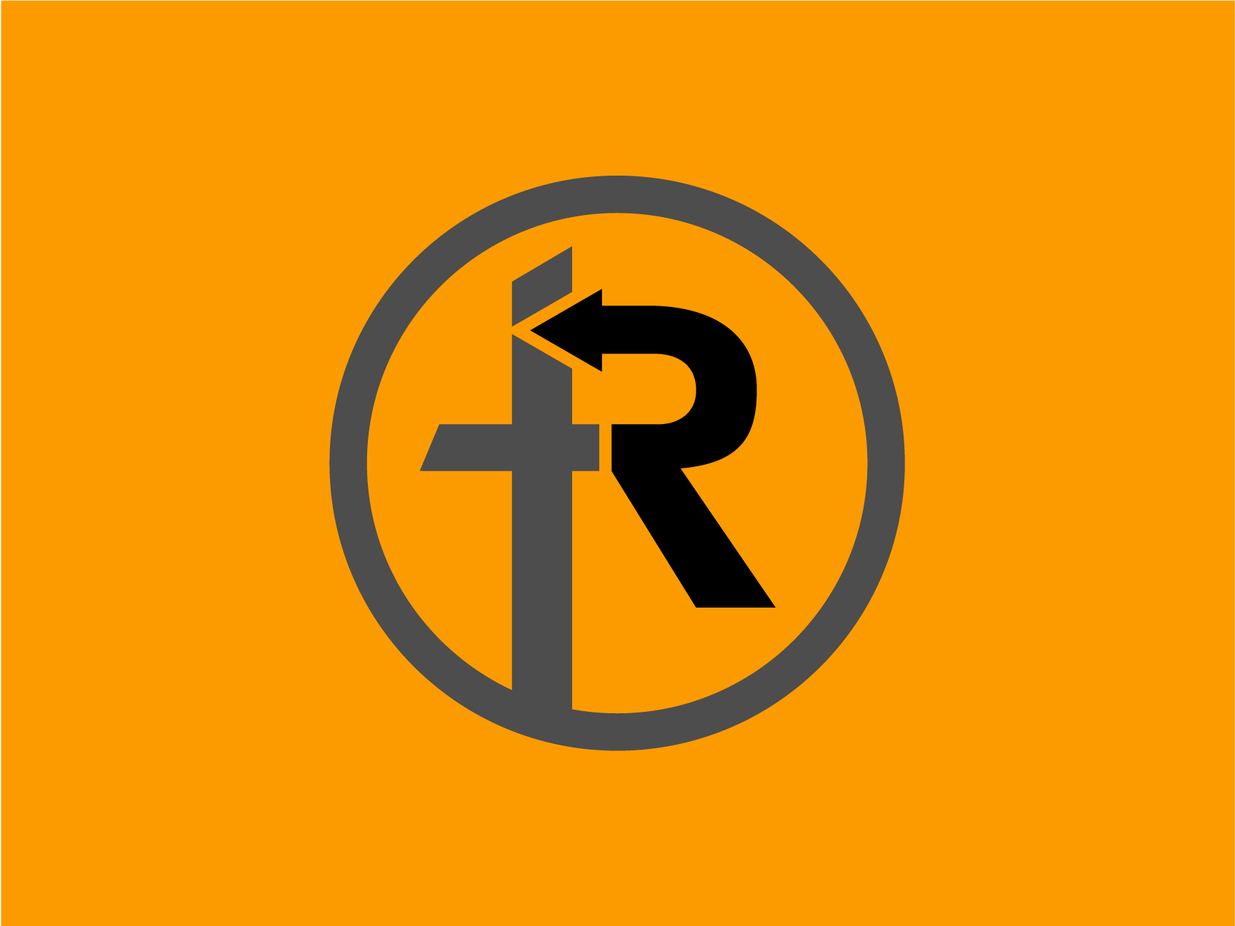
National renewal ministries is a newly planted church that expressed their aspiration in seeing the nation renewed.
after hearing the brief, we immediately knew that we wanted to create a logo that would catch the eye of the masses, so we opted for a modern design.
the logo was created to take the shape of the letter "R" in the style "U-turn" symbol. it was created this way so that the "r" points back to the cross, symbolising the type of renewal briefed by the client.